
At the end of October 2014, Primary Image launched a new website for transport writer and broadcaster Christian Wolmar.
Our designer – Mike – created Christian’s original website a decade ago in 2004 and, to celebrate this fifth incarnation of the website, we take a look back at how it’s evolved over time.
The original website – 2004

 Launched in March 2004, Christian Wolmar’s first website was a simple HTML-based site. Like many websites of the time, it had a left-aligned layout on the computer screen with a vertical navigation bar.
Social features were, not surprisingly, limited. In fact, Facebook only launched to a limited audience a month earlier, in February 2004! And Twitter hadn’t even been invented by this time!
The only interactive features were a “send this page to a friend” email form, a newsletter email subscribe box, and a “Rate this article” facility that simply sent an email to Christian.
Within just a few weeks of launch, traffic started to quickly grow, with readers of his fortnightly Rail magazine column joining him on the new website.
Second website design – 2006

Christian’s second web design was launched in June 2006 with a much improved style. The layout was moved to a centrally-justified column, with extra spacing between boxes, and was better suited to the newer generation of computer monitors. In comparison, it took the BBC News website another two years before they adopted a similar centrally-positioned layout, and of course today this is very much the standard design approach.
Another innovation at this time was the use of a “fluid” layout, which meant that the webpages adjusted for different screen sizes (in this case from 835px up to 1525px). This was ahead of its time and, today, responsive web design now is used by most new websites to adjust the layout to different screen and device sizes.
Also, the red, grey and black colour scheme introduced at this time has been kept ever since in Christian’s subsequent designs.
An improved mailing list system was incorporated, but the website still lacked any real social features.
 Third website design – 2008
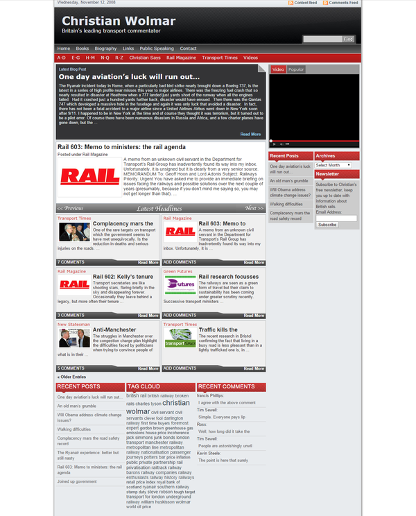
By Autumn 2008, another web designer had taken over running the site and, quite rightly, decided that it was time to move the website onto a Content Management System (CMS) to manage the articles more easily. Web software had significantly improved since the original site was constructed and the designer decided to use a platform called WordPress, which was gaining in popularity.
It was a good move – WordPress soon became the world’s most popular CMS and, in fact, it’s what we now specialise in at Primary Image! The version first used on Christian’s website was WordPress 2.6.3, which lacked the one-click WordPress upgrades, one-click plugin installs, and lots of other things that we now take for granted!
The website introduced a discussion system, where visitors could leave comments beneath each article. It also included adverts for the first time, so the website could start paying for some of its own maintenance, especially as the website was now seeing 1000s of visitors each month.
Fourth website design – 2011

A refresh was carried out in Spring 2011 and bringing with it a lighter feel than the previous design. It used the newly released WordPress 3.0.
It was in the summer of 2012 that Christian moved his website to Primary Image and returning to the designer who created his first two websites. Apart from a few small changes to tidy up the layout, the site’s design remained largely untouched until Primary Image carried out a major revamp in 2014.
 Fifth website design – 2014
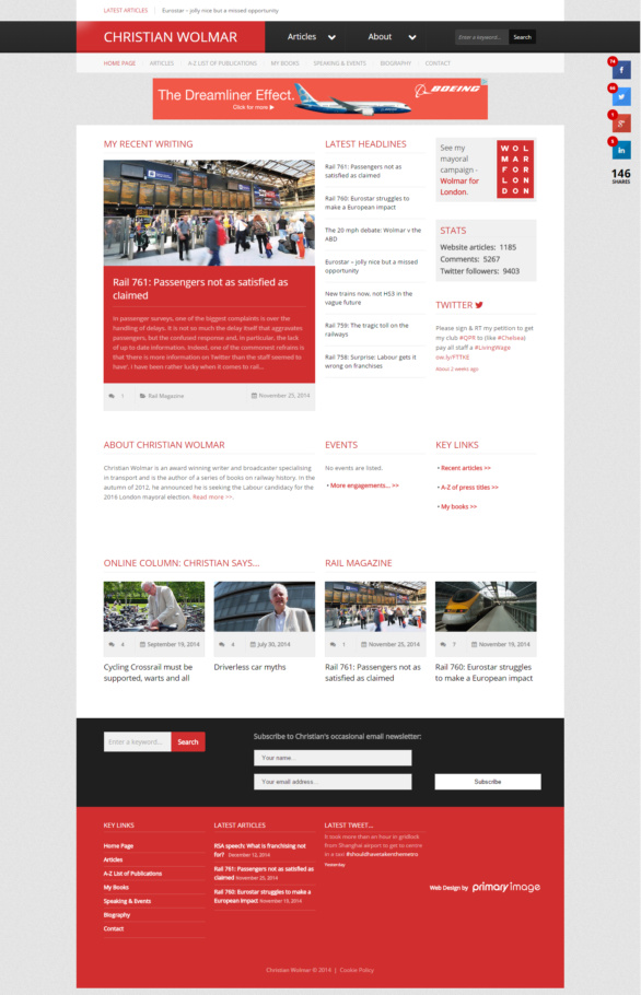
By 2014, the website was in need of a refresh, both in terms of styling, but also it needed an important technical upgrade to enable it to work well with smartphones and tablets. There were also other areas that Christian identified as needing improvement, such as the ease of navigating through the article indexes and having social sharing icons.
The brand-new website was launched at the end of October 2014 and, only by looking back a screenshot above in preparation for this article, it’s evident that this new design actually has a lot of similarities to the design Mike created back in 2006: a strong focus on styling and the design detail; use of white space and padding so the website doesn’t feel crammed; a lighter and more contemporary shade of red (similar to the 2006 colour); and a responsive/fluid layout that adjusts to different screen sizes.
You can read a case study about Christian’s latest 2014 website in our web design portfolio section. His site can be seen at www.christianwolmar.co.uk.
Over the ten years of Christian Wolmar’s website, it’s been fascinating to see how design trends and technology have changed so much. In 2004, people barely ever used the internet on their mobile phones (remember WAP?!) and blogging was only just coming into the mainstream. How things have changed!
Christian Wolmar’s website now contains over 1,100 articles and there’s been over 5,200 comments against his articles.
We very much look forward to working with Christian and his website for many more years to come!
Mike founded Primary Image in 2010. He specialises in the WordPress website platform and speaks regularly at national web design conferences. Mike became a member (MCIPR) of the Chartered Institute of Public Relations in 2015.